Whether it be a presentation, a poster or a project meeting, showing your materials visually has the potential to greatly increase the level of understanding. In fact, all three software I teach (i.e., MAXQDA, NVivo, ATLAS.ti) have built-in functions to easily accomplish this. Let us look at an example using the MAXQDA-->Visual Tools-->MAXMaps function.
Please note that I created this MAXMap from the example project in just minutes. With practice, you can also create a graph to represent aspects of your project within minutes!
Please note that I created this MAXMap from the example project in just minutes. With practice, you can also create a graph to represent aspects of your project within minutes!
Looking at this graph with minimal words, readers can get a LOT of information:
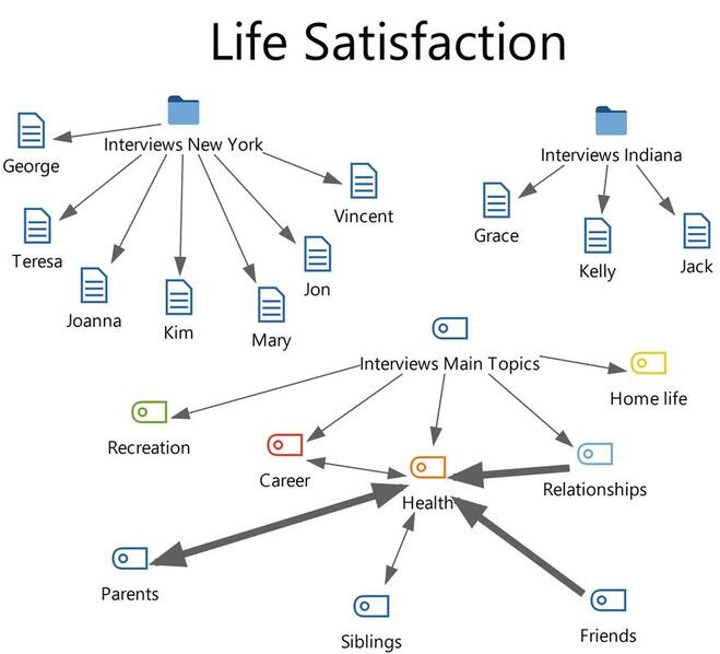
i) Study topic: Obviously the research topic is Life Satisfaction as the header suggests!
ii) Source documents: The main documents are a total of 10 interviews from New York and Indiana.
iii) Main themes: Coding and data analysis result in 5 major themes that affect life satisfaction (recreation, career, health, relationships and home life).
iv) Subtopics under Health: The theme Health is subdivided into parents, siblings and friends.
v) Direction of links: The links tell you important information about the relations among the themes. For example, relationships lead to health, career is associated with health with no causal relationship.
vi) Thickness of links: The strength of the relations is also visualized in the links. For instance, parents and friends are stronger indicators of health compared to siblings.
Last pointer: This graph may look simple but it does give readers a holistic view of the project and results. Just remember not to put too many objects into the graph or else it will look “too busy” to be understood!
